Great user experience is all about creating human-centered designs that blend content with physical, online, and mobile environments. From ideas to prototype development, designs can go through a variety of evaluation methods, including focus groups, screen interface usability testing, user surveys, and phone interviews. I call this the “tested before invested” approach. It encourages design risks early in the process and provides some assurance the more expensive design options are worth developing at scale.
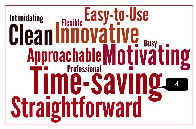
Here is an opinion survey turned into a word collage. Eight people chose from a list of twelve pairs of words. Each word-pair contains a positive and equally negative word (i.e. motivating and boring, intimidating and approachable). The result provides a quick glance of how users are feeling about the product. It’s always nice to see consensus around positive words, such as “clean” and “motivating.” And seeing 4 out of 8 people choosing the word “time-saving” is a great sign a half-built product is on the right track.
![]()
Here is a screen grab from a test that recorded users’ biometrics. Think eye tracking, heart rate, EEG patterns, etc. The goal was to measure the user’s short and long-term engagement with learning content.
After comparing the same content in our old and new design, an independent biometrics usability test of fifty users showed great results. Students and faculty rated the new design to be engaging and likely to save valuable time. The tests showed a significant increase in quiz scores, which was great news. But more importantly, we learned which elements in the course (big or small) will tend to spike and prolong engagement. This is gold when it comes to using new rules-of-thumb that can be applied to future designs.
I’ve commissioned usability testing services several times over the years and have co-developed as many test plans. I’ve learned a little can go a long way in terms of providing actionable feedback. There is an art to knowing what amount of newly-coded product is worth testing. The product can’t be too immature or the feedback won’t be valuable. Users will confirm what you already know is not working. The product can’t be too mature or you will have missed the opportunity to be “tested before fully invested.” I seemed to have averaged around three tests strategically-placed during iterative development of a single product (or product feature).
Today, I’m a big proponent of human-centered, universal design principles, thinking about accessibility first rather than after-the-fact. If scaling quickly is the challenge, embrace standards whenever and wherever possible. If creating a killer new brand is the challenge, focus on the users’ needs first, simplicity is paramount. If it doesn’t have a function, don’t give it a form.